
Landing page
A branded page that sells your coaching, shows your plans and turns visitors into clients.
Your landing page
Your landing page is where new clients find you, see your plans, and sign up.
Pick a template
Start from a template, or from a blank page.
Preview and use it
Preview it full size, on a desktop or a phone, then give it a name and use it.
Add sections
Add sections: here, your bookable sessions, straight from your schedule.
General style
General style sets the colours and the fonts for the whole page.
The AI designer
The AI designer rewrites copy, or whole sections, when you ask.
Save and publish
Save as you go, and publish when it is ready. One design is live at a time, at your own address.
More details and screenshots
Landing page
A public page that sells your coaching. Visitors read about you, buy a plan or book a session, no account needed. Available on Premium and Ultimate.
Your designs
The landing page item in the menu opens your designs. You can keep up to 5. Only one is live at a time, the others are drafts.
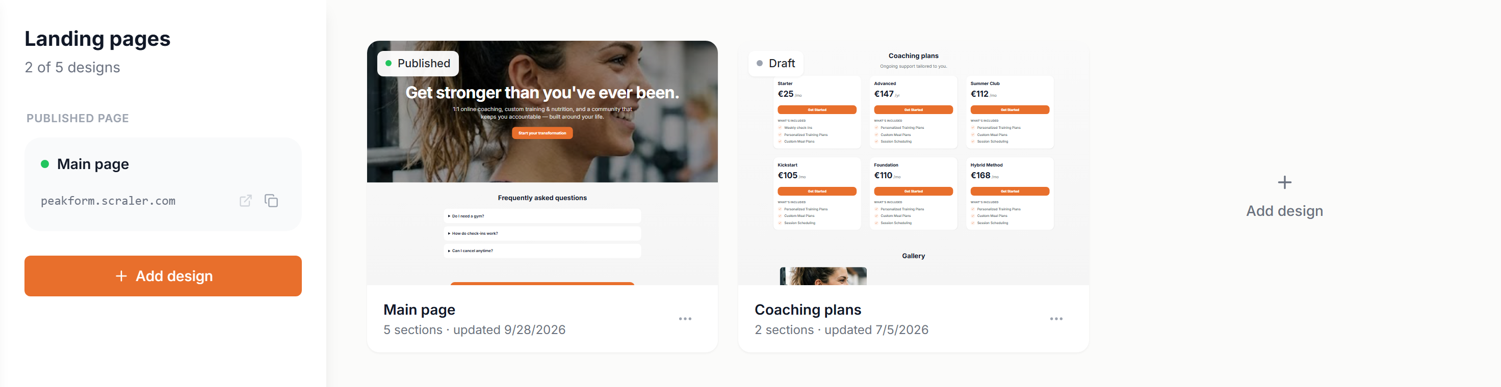
- Published page
- The live design and its address. Open it or copy the link.
- Card menu
- The ••• button on a card has Open editor, Publish or Unpublish, and Delete. Unpublish a live design before you delete it.
- Rename
- Click the design name at the top of the editor.
Start a new page
Add design opens the template gallery. Each template is drawn with your brand colour, your business name and your own plans and products, so you see how it would look for you.
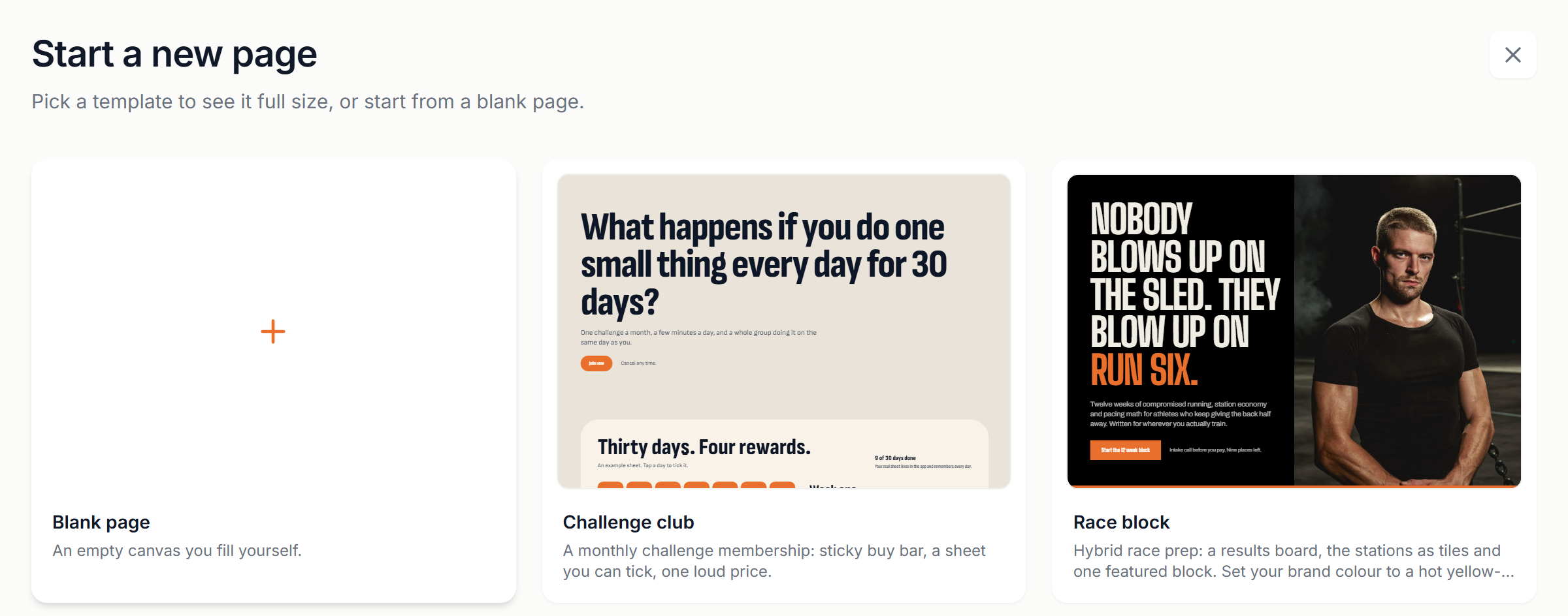
Click a template to see it full size. Switch between Desktop and Mobile, give the design a name and click Use this template. Or pick Blank page, then Build from scratch or Build with AI.
Templates
The builder
Click a design to open it. The rail on the left edits the page. The preview on the right shows it the way visitors see it.
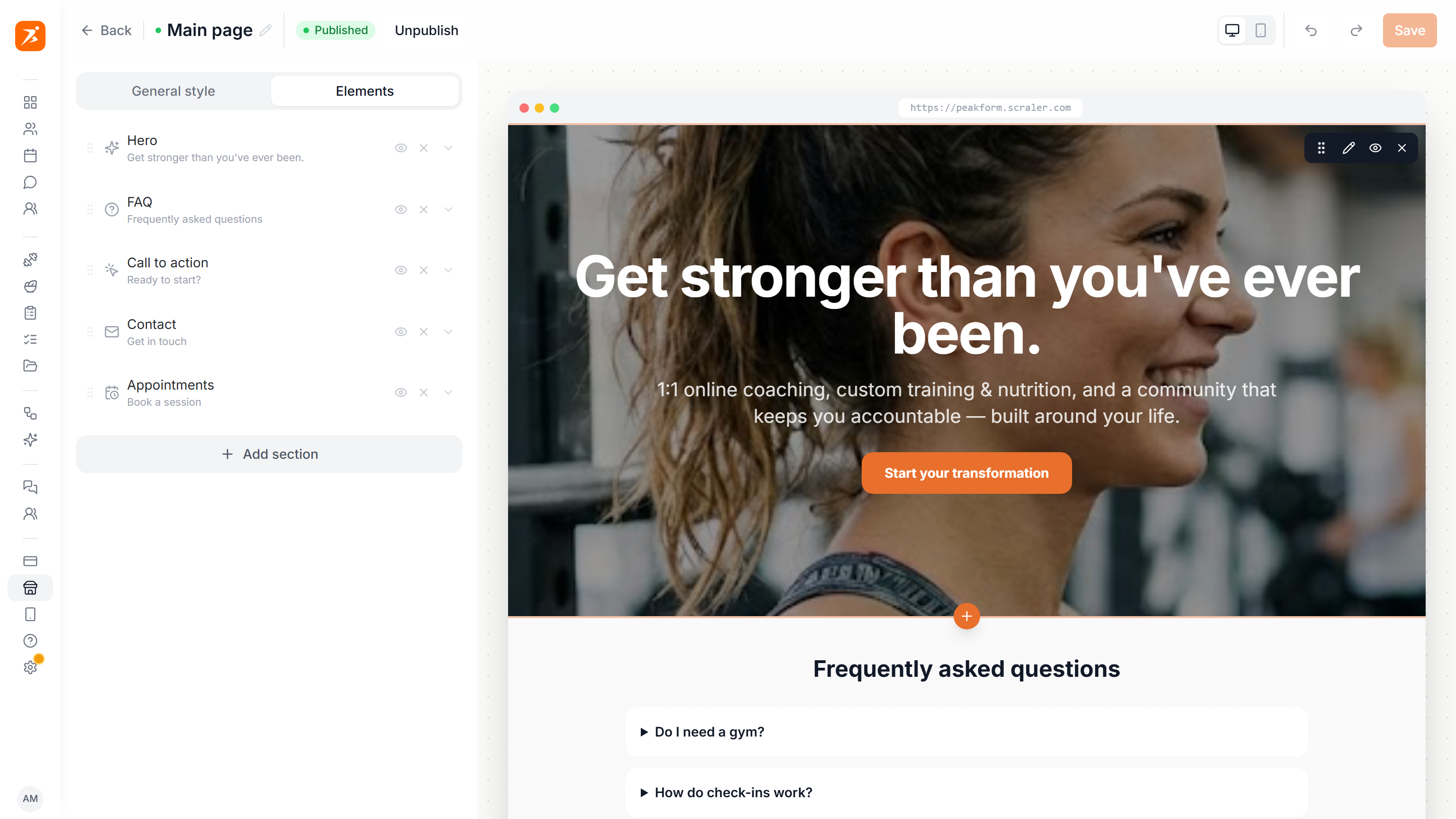
- Elements
- Your sections in page order. Drag to reorder, hide or remove one, or open it to edit its text, images and style.
- General style
- The look of the whole page: page colours, fonts and headings, corners, the default button text and a Starting look preset.
- Preview
- Hover a section to edit, hide, drag or remove it. The + under a section adds a new one right there. The phone icon shows the mobile layout.
- Save
- Your changes are kept when you click Save. Saving the live design updates the public page straight away.
AI landing page designer. The sparkle button in the bottom right corner opens a chat. Ask for a whole page or one change, like a new FAQ or a darker look, and the preview updates. Each of your messages has a revert arrow that puts the page back to that point. Save when you like the result.
Sections
A page is a stack of sections. Add section opens this list. Every section also has a Style group for its background, spacing, alignment, heading sizes and a small label above the heading.
TabsLayout
Split the page into switchable tabs. Sections above the switcher show on every tab.
Hero
Headline, photo and a button
Ticker
A line of short phrases that scrolls sideways
Image and text
A photo beside your story, a quote or a fact sheet
Figures
Big numbers with a label each
Steps
Numbered how it works cards
Rows
A timetable, results board or fact sheet
Two lists
Two lists side by side, like who it suits and who it does not
Challenge sheet
A day by day sheet visitors can tick
Timeline
What a day or a week looks like
Your app
A phone showing the app you designed in My App
Memberships
Your subscription plans, with checkout
Programs
One-time products: plans, cookbooks, files
Events
Your upcoming events, bookable
Appointments
Appointment types visitors can book a time for
Transformations
Before and after results
Image
A single image or banner
Gallery
Photos as a grid, carousel, panels or mosaic
Testimonials
Quotes from clients, with ratings and results
Affiliate links
Links you recommend and earn from
FAQ
Questions that fold open
Call to action
A focused banner with one button
Contact
Email, phone and social links
Footer
Wordmark, links and small print
Top bar
Wordmark, links and a button, pinned to the top
Sticky buy bar
A buy button pinned to the bottom on phones
Hero, Challenge sheet, Your app, Contact, Footer, Top bar, Sticky buy bar and Tabs fit on a page once.
Sections that sell. Memberships, Programs, Events and Appointments show what you already set up: subscription plans, products, events and appointment types. Pick which ones to show, or pick none to show them all. Prices and checkout come from the item itself, so a new price never means editing the page. A product only appears when Show on Pricing Page is on.
Buttons in the Hero, Call to action, Top bar and other sections can jump to a section, open a link, or go straight to the checkout of one plan or product.
Publishing
Click Publish in the editor's top bar or in the card menu. If another design is live, you confirm first, because publishing takes that one offline.
- Address
- Visitors see the live page at your subdomain, yourname.scraler.com, or at your own domain once it is verified. Both are set in Settings, Custom Domain.
- No domain
- Publish stays hidden until you have one. The list shows Connect a domain to publish instead.
- Unpublish
- Takes the page offline. The design stays as a draft, ready to publish again.